Designing visuals
to set you apart!

Merritt Designs has more than 15 years of experience designing graphics and custom illustrations for all of your print, brand identity, and promotional needs!

Portfolio
Design Services
Get In Touch

Case Study: Putting On Air’s Sea Land And Air Golf Safaris
Case Study: Corona Extra – CoronaVille Beer Nuts
Case Study: Ron Jon Surf Shop Design
Case Study: Red Sky At Night, Sailors Delight
Case Study: Wet’n Wild Orlando – Welcome to Parrot-Dise
Case Study: Ron Jon Grillin’ & Chillin’
Case Study: Ron Jon – God Of Surf
Case Study: Ron Jon – Waiting For The Wave
Case Study: Into The Drink

Case Study: Wet’n Wild Orlando – Welcome to Parrot-DiseK

Client: Wet’n Wild Orlando
Project: Welcome to Parrot-Dise Graphic Design

Overview
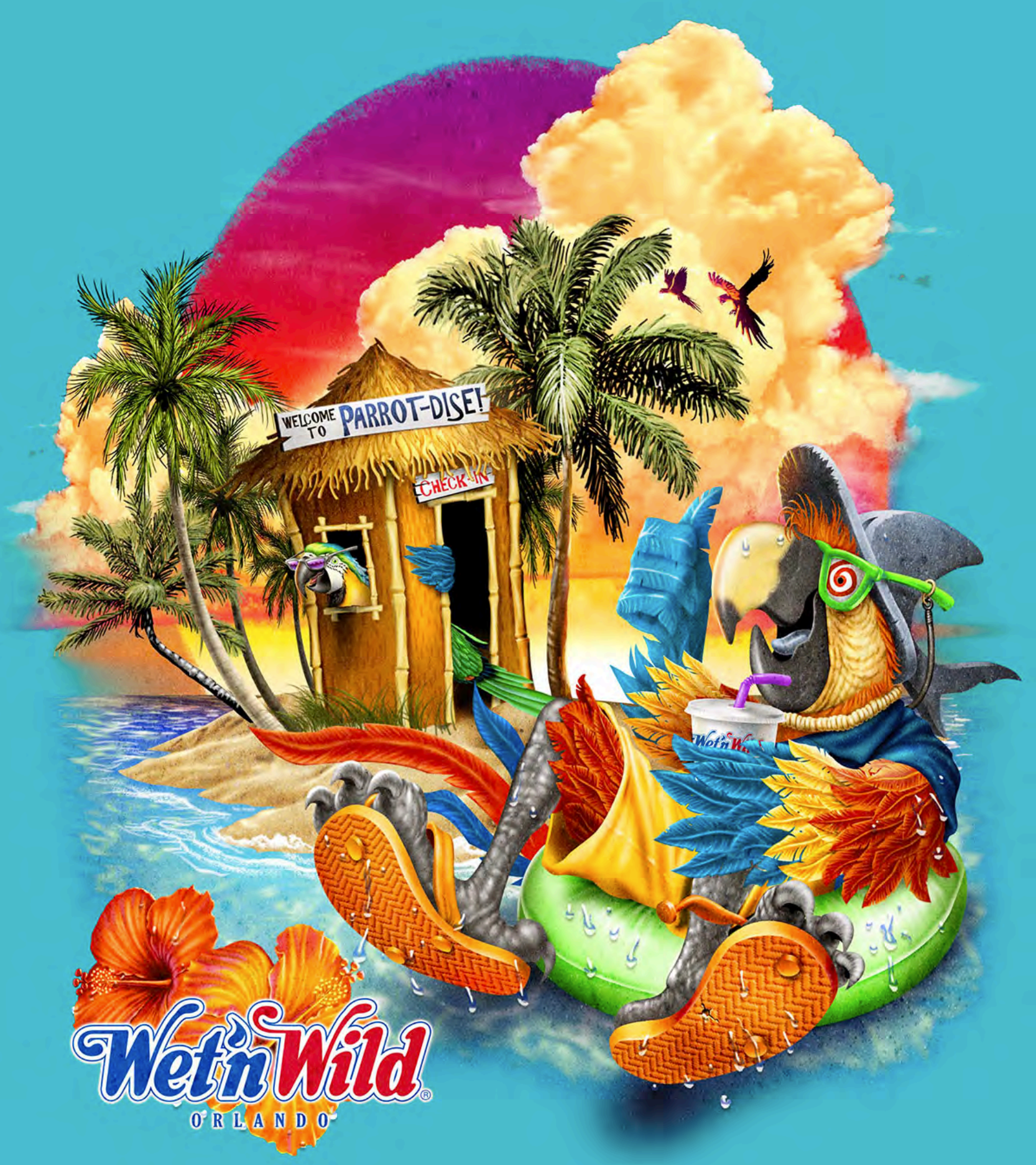
Wet’n Wild Orlando needed a vibrant and fun graphic for their new campaign, “Welcome to Parrot-Dise.” The goal was to create a playful and inviting visual that captures the essence of a tropical water adventure, resonating with visitors of all ages.

Objectives
Create a Playful Visual: Design a graphic that embodies the fun and tropical spirit of Wet’n Wild Orlando.
Incorporate Brand Elements: Use the brand’s logo and align with the vibrant and adventurous identity of Wet’n Wild Orlando.
Solution
Tropical Composition: An illustration featuring a colorful parrot wearing swimwear, lounging on a floating tube. The backdrop includes a picturesque island with a welcoming hut, complete with a sign that reads “Welcome to Parrot-Dise.” The entire scene is set against a lush tropical landscape, with palm trees, sandy beaches, and crystal-clear waters.
Brand Integration: The Wet’n Wild Orlando logo is seamlessly integrated into the design, along with elements like tropical plants and beach accessories to enhance brand identity and create a cohesive visual narrative.
Outcome
The “Welcome to Parrot-Dise” graphic was a tremendous success, significantly boosting engagement and resonating deeply with the audience. The playful and tropical visual drew significant attention and positive feedback from customers, effectively enhancing the brand’s image and promoting a sense of fun and adventure.

Client Testimonial
“The ‘Welcome to Parrot-Dise’ graphic perfectly captures the fun and tropical spirit of our park. It has been a fantastic addition to our campaign and has received an overwhelmingly positive response.” – Wet’n Wild Orlando Team

Conclusion
The project successfully encapsulated the essence of Wet’n Wild Orlando, creating a memorable and impactful visual that energized their campaign. The playful imagery and seamless brand integration conveyed a sense of tropical adventure and relaxation, resonating deeply with the audience and enhancing the brand’s lively identity.

Case Study: Corona Extra – CoronaVille Beer NutsK

Client: Corona Extra
Project: CoronaVille Beer Nuts Graphic Design

Overview
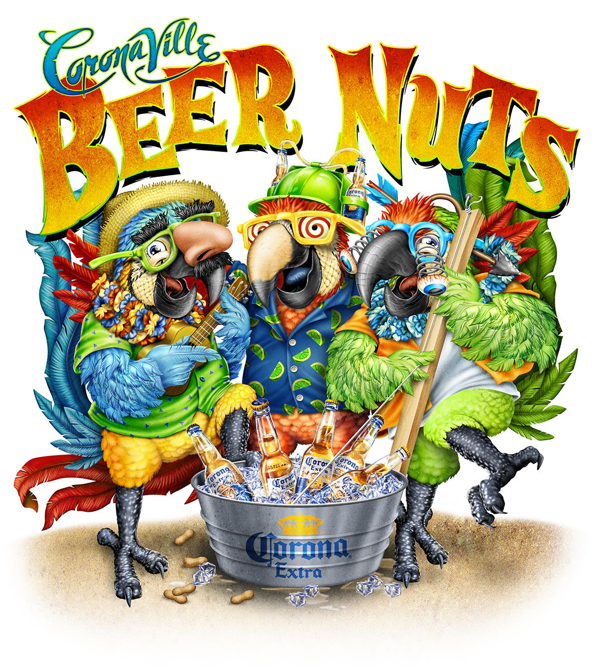
Corona Extra needed a vibrant and engaging graphic for their new campaign, “CoronaVille Beer Nuts.” The aim was to create a playful and tropical visual that reflects the fun and festive nature of the brand, highlighting the laid-back beach lifestyle that Corona embodies.

Objectives
Create a Playful Visual: Design a graphic that embodies the fun and tropical spirit of Corona Extra.
Incorporate Brand Elements: Use the iconic Corona Extra logo and align with the brand’s relaxed and festive identity.
Solution
Festive Composition: An illustration featuring three parrots wearing tropical clothes, funny glasses, and hats, standing around a bucket of iced Corona beers. The bucket prominently displays the Corona Extra logo. The scene is set on a vibrant tropical beach, complete with palm trees, sand, and the ocean in the background.
Brand Integration: The Corona Extra logo is seamlessly integrated into the design, along with elements like tropical plants, beach accessories, and a clear blue sky to enhance brand identity and create a cohesive visual narrative.
Outcome
The “CoronaVille Beer Nuts” graphic was a tremendous success, significantly boosting engagement and resonating deeply with the audience. The playful and tropical visual drew significant attention and positive feedback from customers, effectively enhancing the brand’s image and promoting a sense of fun and relaxation.

Client Testimonial
“The ‘CoronaVille Beer Nuts’ graphic perfectly captures the festive and tropical spirit of our brand. It has been a fantastic addition to our campaign and has received an overwhelmingly positive response.” – Corona Extra Team

Conclusion
The project successfully encapsulated the essence of Corona Extra, creating a memorable and impactful visual that energized their campaign. The playful imagery and seamless brand integration conveyed a sense of fun and beach lifestyle, resonating deeply with the audience and enhancing the brand’s festive identity.

Case Study: Ron Jon Grillin’ & Chillin’K

Client: Ron Jon Surf Shop
Project: Grillin’ & Chillin’ Graphic Design

Overview
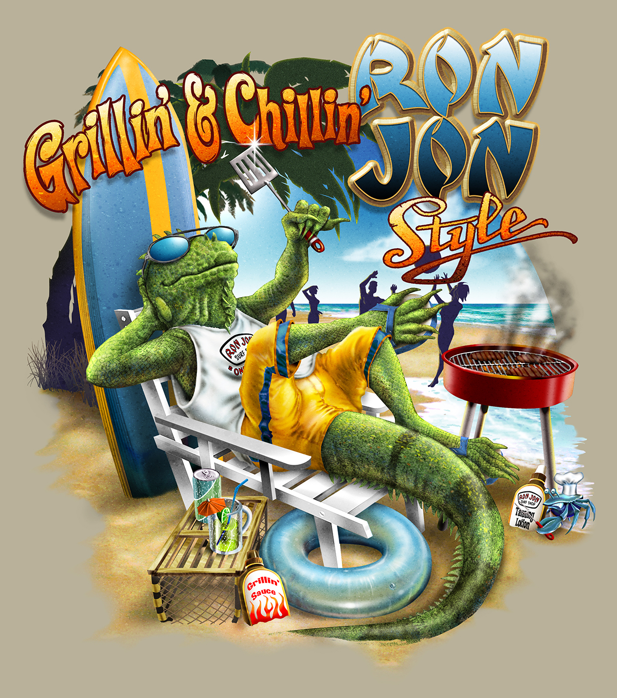
Ron Jon Surf Shop needed a fun and engaging graphic for their new campaign, “Grillin’ & Chillin’.” The goal was to create a vibrant and laid-back visual that captures the essence of relaxation and beach lifestyle associated with the brand.

Objectives
Create a Fun Visual: Design a graphic that embodies the relaxed and fun spirit of Ron Jon Surf Shop.
Incorporate Brand Elements: Use the iconic Ron Jon logo and align with the brand’s laid-back and beach-centric identity.
Solution
Relaxed Composition: An illustration of a surfer iguana sitting on a beach chair, grilling, and wearing Ron Jon clothing with sunglasses. The scene is set on a sunny beach, capturing the essence of a perfect day of relaxation and fun.
Brand Integration: The Ron Jon logo is seamlessly integrated into the design, along with beach elements like palm trees, surfboards, and the ocean to enhance brand identity and create a cohesive visual narrative.
Outcome
The “Grillin’ & Chillin'” graphic was a huge success, significantly boosting engagement and resonating deeply with the audience. The fun and relaxed visual drew significant attention and positive feedback from customers, effectively enhancing the brand’s image and promoting a sense of beach lifestyle and enjoyment.

Client Testimonial
“The ‘Grillin’ & Chillin” graphic perfectly captures the relaxed and fun spirit of our brand. It has been a fantastic addition to our campaign and has received an overwhelmingly positive response.” – Ron Jon Surf Shop Team

Conclusion
The project successfully encapsulated the essence of Ron Jon Surf Shop, creating a memorable and impactful visual that energized their campaign. The relaxed imagery and seamless brand integration conveyed a sense of fun and beach lifestyle, resonating deeply with the audience and enhancing the brand’s laid-back identity.

Case Study: Putting On Air’s Sea Land And Air Golf SafarisK

Client: Putting On Air’s
Project: Sea Land And Air Golf Safaris Graphic Design

Overview
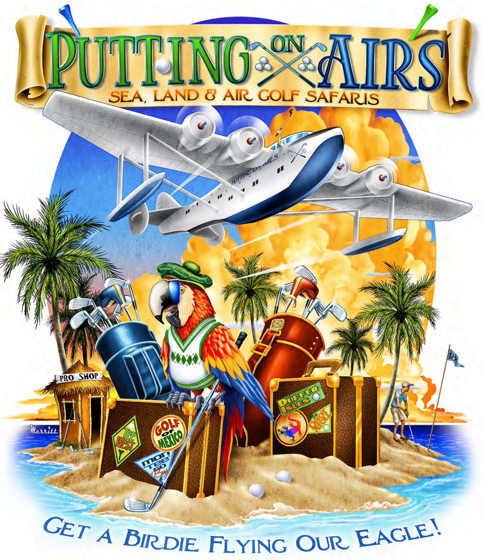
Putting On Air’s needed an engaging graphic for their new campaign, “Sea Land And Air Golf Safaris.” The aim was to create a dynamic and playful visual that highlights the unique and adventurous nature of their golf safari packages.

Objectives
Create a Dynamic Visual: Design a graphic that embodies the fun and adventurous spirit of Putting On Air’s golf safaris.
Incorporate Brand Elements: Use the brand’s logo and align with the lively and exploratory identity of Putting On Air’s.
Solution
Playful Composition: An illustration of a golfing parrot standing on a suitcase with golf clubs behind it on a sandy beach island, surrounded by the ocean. Above, a float plane flies in a beautiful sky. The text “Putting On Air’s Sea Land And Air Golf Safaris, Get a birdie flying our eagle” is prominently displayed, adding a playful twist to the golfing theme.
Brand Integration: The Putting On Air’s logo is seamlessly incorporated into the design, along with elements like tropical plants and ocean waves to enhance brand identity and create a cohesive visual narrative.
Outcome
The “Sea Land And Air Golf Safaris” graphic was a tremendous success, significantly boosting engagement and resonating deeply with the audience. The dynamic and playful visual drew significant attention and positive feedback from customers, effectively enhancing the brand’s image and promoting a sense of adventure and fun.

Client Testimonial
“The ‘Sea Land And Air Golf Safaris’ graphic perfectly captures the adventurous and playful spirit of our brand. It has been a fantastic addition to our campaign and has received an overwhelmingly positive response.” – Putting On Air’s Team

Conclusion
The project successfully encapsulated the essence of Putting On Air’s, creating a memorable and impactful visual that energized their campaign. The playful imagery and seamless brand integration conveyed a sense of adventure and fun, resonating deeply with the audience and enhancing the brand’s lively identity.

Case Study: Red Sky At Night, Sailors DelightK

Client: Coastal Breeze Apparel
Project: Red Sky At Night, Sailors Delight Graphic Design

Overview
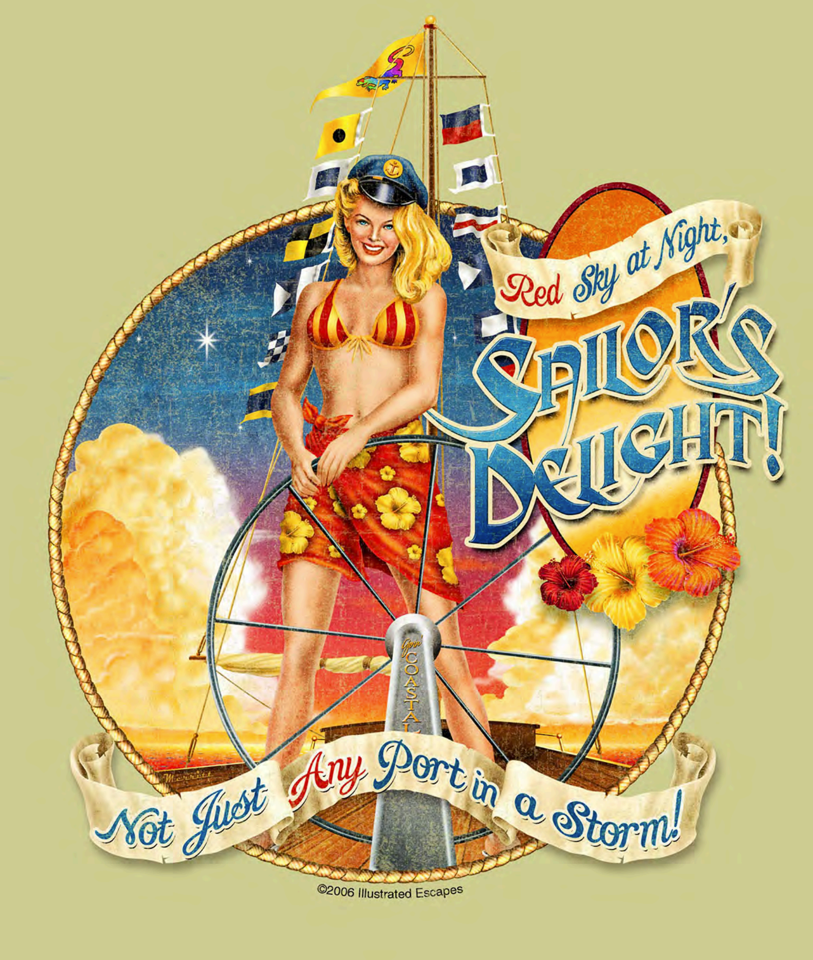
Coastal Breeze Apparel needed a striking graphic for their new campaign, “Red Sky At Night, Sailors Delight.” The objective was to create a captivating and adventurous visual that reflects the brand’s nautical theme and adventurous spirit.

Objectives
Create an Adventurous Visual: Design a graphic that embodies the adventurous and nautical spirit of Coastal Breeze Apparel.
Incorporate Brand Elements: Use the brand’s logo and align with the bold and adventurous identity of Coastal Breeze Apparel.
Solution
Captivating Composition: An illustration of a blonde woman in a captain’s hat and bikini, confidently steering a sailing ship, set against a backdrop of a stunning, cloudy sky at dusk. The text “Red Sky At Night, Sailors Delight. Not Just Any Port in the Storm” is prominently displayed to evoke a sense of adventure and nautical tradition.
Brand Integration: The Coastal Breeze Apparel logo is subtly integrated into the design, along with elements like the ship’s wheel, ocean waves, and the dramatic sky to enhance brand identity and create a cohesive visual narrative.
Outcome
The “Red Sky At Night, Sailors Delight” graphic was a tremendous success, significantly boosting engagement and resonating deeply with the audience. The bold and adventurous visual drew significant attention and positive feedback from customers, effectively enhancing the brand’s image and promoting a sense of nautical adventure.

Client Testimonial
“The ‘Red Sky At Night, Sailors Delight’ graphic perfectly captures the adventurous and nautical spirit of our brand. It has been a fantastic addition to our campaign and has received an overwhelmingly positive response.” – Coastal Breeze Apparel Team

Conclusion
The project successfully encapsulated the essence of Coastal Breeze Apparel, creating a memorable and impactful visual that energized their campaign. The adventurous imagery and seamless brand integration conveyed a sense of nautical excitement and tradition, resonating deeply with the audience and enhancing the brand’s bold identity.

Case Study: Just Lei BackK

Client: Island Vibes Co.
Project: Just Lei Back Graphic Design

Overview
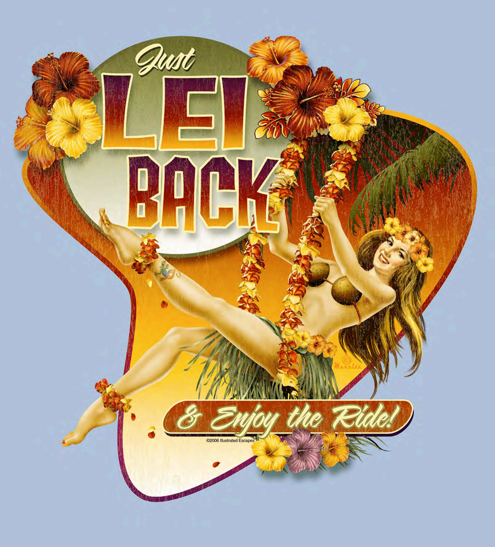
Island Vibes Co. needed a visually appealing graphic for their new campaign, “Just Lei Back.” The goal was to create a serene and inviting visual that captures the relaxed, tropical essence of their brand.

Objectives
Create a Relaxing Visual: Design a graphic that embodies the calm and tranquil spirit of Island Vibes Co.
Incorporate Brand Elements: Use the brand’s logo and align with the relaxed and tropical identity of Island Vibes Co.
Solution
Serene Composition: An illustration of a Hawaiian woman on a swing, adorned with flowers in her hair and wearing a grass skirt, set in a lush tropical setting. The text “Just Lei Back and Enjoy The Ride” is prominently displayed to evoke a sense of relaxation and enjoyment.
Brand Integration: The Island Vibes Co. logo is subtly incorporated into the design, along with tropical elements like palm trees, vibrant flowers, and a clear blue sky to enhance brand identity and create a cohesive visual experience.
Outcome
The “Just Lei Back” graphic was highly successful, significantly boosting engagement and resonating deeply with the audience. The serene and inviting visual drew significant attention and positive feedback from customers, effectively enhancing the brand’s image and promoting a sense of relaxation.

Client Testimonial
“The ‘Just Lei Back’ graphic perfectly captures the relaxed and tropical spirit of our brand. It has been a fantastic addition to our campaign and has received an overwhelmingly positive response.” – Island Vibes Co. Team

Conclusion
The project successfully encapsulated the essence of Island Vibes Co., creating a memorable and impactful visual that energized their campaign. The serene imagery and seamless brand integration conveyed a sense of tranquility and enjoyment, resonating deeply with the audience and enhancing the brand’s relaxed identity.

Case Study: Into The DrinkK

Client: Beach Breeze Ventures
Project: Into The Drink Graphic Design

Overview
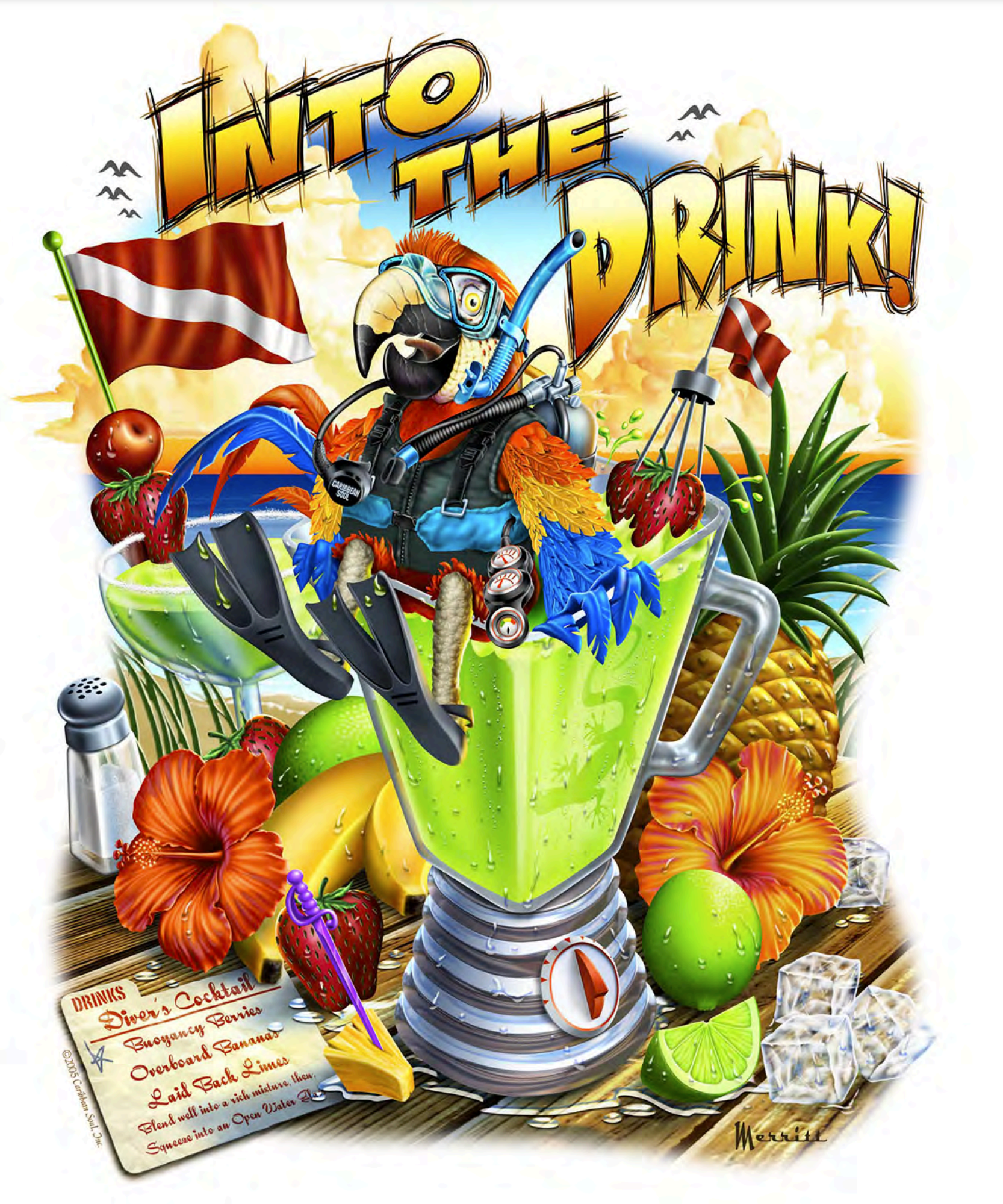
Beach Breeze Ventures needed a captivating graphic for their new campaign, “Into The Drink.” The goal was to create a playful and imaginative visual that highlights the fun and adventurous spirit of the brand.

Objectives
Create a Playful Visual: Design a graphic that embodies the fun and adventurous nature of Beach Breeze Ventures.
Incorporate Brand Elements: Use the brand’s logo and align with the lively and whimsical identity of Beach Breeze Ventures.
Solution
Imaginative Composition: An illustrated parrot in scuba gear, poised to plunge into a blender filled with a tropical beverage, set against a vibrant beach background. This whimsical scene captures the essence of fun and adventure.
Brand Integration: The Beach Breeze Ventures logo is seamlessly integrated into the design, along with tropical elements like palm trees and beach accessories to enhance brand identity and create a cohesive visual narrative.
Outcome
The “Into The Drink” graphic was a huge success, greatly boosting engagement and resonating deeply with the audience. The playful and imaginative visual drew significant attention and positive feedback from customers, effectively enhancing the brand’s image.

Client Testimonial
“The ‘Into The Drink’ graphic perfectly captures our brand’s playful spirit. It has been a fantastic addition to our campaign and has received an overwhelmingly positive response.” – Beach Breeze Ventures Team

Conclusion
The project effectively encapsulated the spirit of Beach Breeze Ventures, creating a memorable and impactful visual that energized their campaign. The imaginative imagery and seamless brand integration conveyed a sense of fun and adventure, resonating deeply with the audience and enhancing the brand’s lively identity.

Case Study: Ron Jon – God Of SurfK

Client: Ron Jon Surf Shop
Project: God Of Surf Graphic Design

Overview
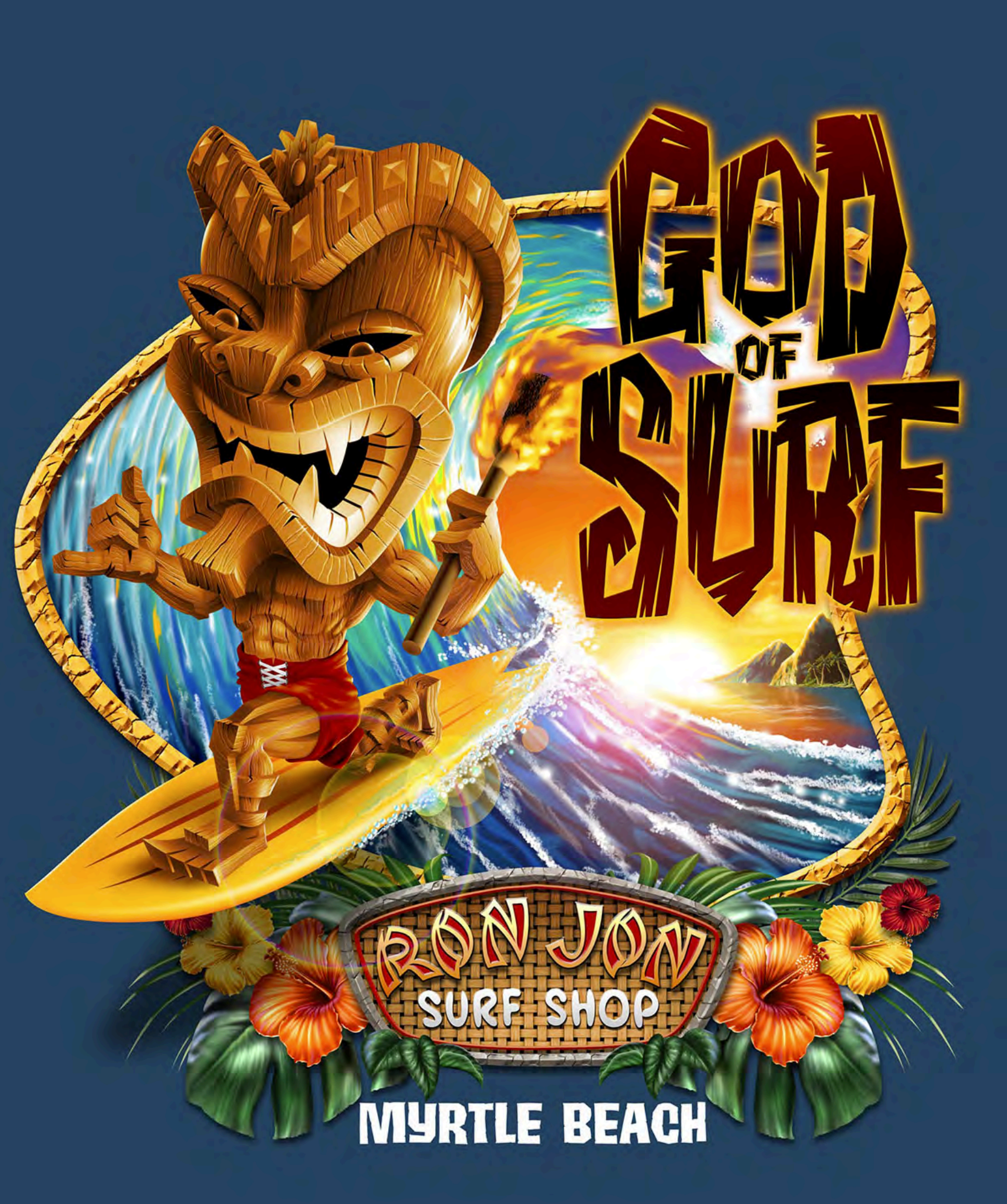
Ron Jon Surf Shop needed a striking graphic for their new campaign, “God Of Surf.” The aim was to encapsulate the power, freedom, and majesty of surfing, portraying it as a divine experience.

Objectives
Create a Powerful Visual: Design a graphic that conveys the awe and grandeur of surfing as a transcendent experience.
Incorporate Brand Elements: Utilize the iconic Ron Jon logo and align with the brand’s adventurous and bold spirit.
Solution
Majestic Composition: A dramatic illustration of a surfer riding an enormous wave, surrounded by a vibrant sunset sky, emphasizing the grandeur of surfing.
Brand Integration: The Ron Jon logo is seamlessly incorporated with elements like waves and tropical motifs to enhance brand identity and create a cohesive visual.
Outcome
The “God Of Surf” graphic was a tremendous success, significantly boosting engagement and deeply resonating with the surfing community. The powerful visual helped to elevate the campaign, drawing attention and admiration from both existing and new customers.

Client Testimonial
“The ‘God Of Surf’ graphic captures the essence of surfing’s power and beauty. It has been a fantastic addition to our campaign and has received an overwhelmingly positive response.” – Ron Jon Surf Shop Team

Conclusion
The project effectively captured the spirit of Ron Jon Surf Shop, creating a memorable and impactful visual that energized their campaign. The powerful imagery and seamless brand integration helped to convey the majestic experience of surfing, resonating deeply with the audience and enhancing the brand’s adventurous image.

Case Study: Ron Jon – Waiting For The WaveK

Client: Ron Jon Surf Shop
Project: Waiting For The Wave Graphic Design

Overview
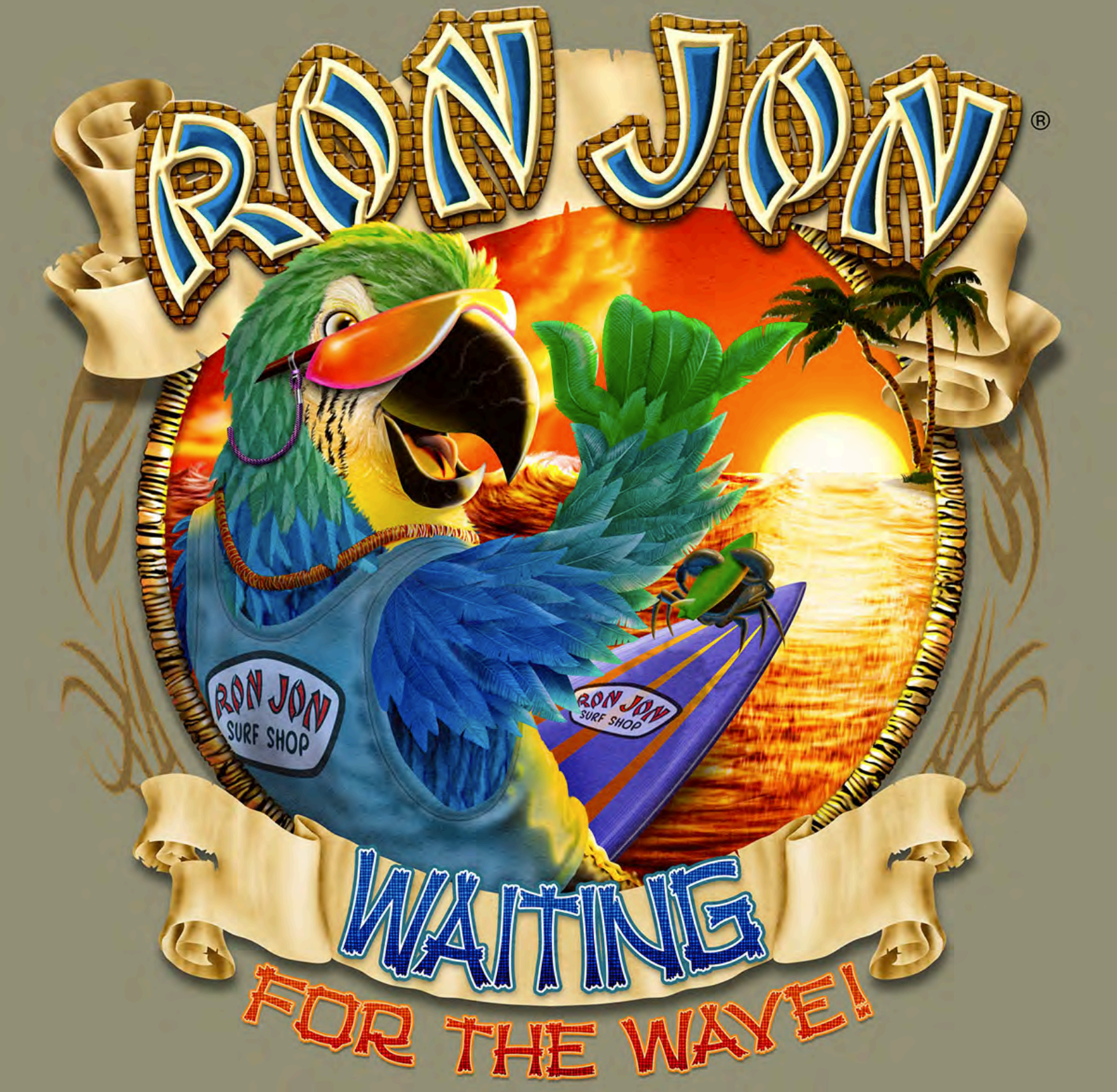
Ron Jon Surf Shop needed an eye-catching graphic for their new campaign, “Waiting For The Wave.” The goal was to capture the essence of anticipation and excitement associated with surfing.

Objectives
Create a Vibrant Visual: Design a graphic that embodies the thrill of waiting for the perfect wave.
Incorporate Brand Elements: Use the iconic Ron Jon logo and align with the brand’s adventurous spirit.
Solution
Dynamic Composition: A vivid illustration of a surfer on the beach, looking out at the sea with surfboard in hand.
Brand Integration: Seamlessly incorporated the Ron Jon logo and tropical elements to enhance brand identity.
Outcome
The “Waiting For The Wave” graphic was a hit, boosting engagement and resonating deeply with the surfing community.

Client Testimonial
“The graphic perfectly captures the anticipation and excitement of surfing. It’s been a great addition to our campaign.” – Ron Jon Surf Shop Team

Conclusion
The project successfully encapsulated the spirit of Ron Jon Surf Shop, creating a memorable and impactful visual that energized their campaign.

Case Study: Ron Jon Surf Shop DesignK

Case Study: Ron Jon Surf Shop Design
Client: Ron Jon Surf Shop
Design Agency: MerrittDesigns
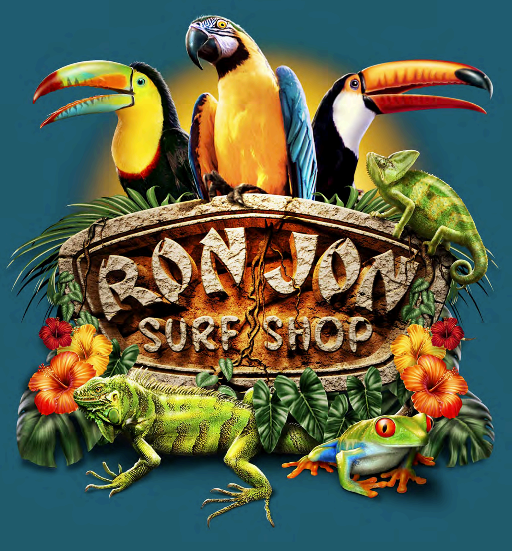
Project: Logo Redesign Incorporating Tropical Wildlife

Project Overview
Ron Jon Surf Shop approached MerrittDesigns with a request to redesign their iconic logo. The objective was to create a visually captivating logo that embodies the vibrant and adventurous spirit of the brand, while incorporating elements of tropical wildlife to resonate with their target audience.

Objectives
Modernize the Logo: Refresh the existing logo to make it more contemporary while retaining its recognizability.
Incorporate Tropical Wildlife: Include various tropical animals to emphasize the brand’s connection to nature and adventure.
Enhance Visual Appeal: Use vivid colors and dynamic composition to create an eye-catching design suitable for various marketing materials.
Design Elements
Central Logo:

The core of the design remains the “Ron Jon Surf Shop” text, styled in a rugged, hand-carved stone texture. This maintains the brand’s established identity and rugged, adventurous appeal.
Top Wildlife Elements:

Parrot: Positioned centrally above the logo, the parrot represents exotic beauty and freedom, attracting attention with its vibrant plumage.
Toucans: Flanking the parrot on either side, the toucans add balance to the design. Their bright beaks and contrasting colors enhance the tropical theme.
Chameleon: Perched on the right side of the logo, the chameleon adds a playful touch, symbolizing adaptability and the dynamic nature of the brand.
Bottom Wildlife Elements:

Iguana: Positioned to the left below the logo, the iguana adds a rugged, adventurous feel. Its green scales blend harmoniously with the surrounding vegetation.
Red-Eyed Tree Frog: Positioned to the right, the frog’s vivid colors provide a striking contrast and a playful element, enhancing the logo’s visual appeal.
Tropical Vegetation:

Hibiscus Flowers: Brightly colored hibiscus flowers surround the logo, adding a burst of color and enhancing the tropical vibe.
Green Foliage: Various tropical leaves and plants provide a lush background, making the wildlife elements stand out and creating a cohesive composition.
Design Process
Concept Development:

MerrittDesigns began with sketches and digital mockups to explore different arrangements of the wildlife elements around the central logo.
The team selected vibrant, tropical colors to ensure the design would be eye-catching and align with the brand’s adventurous spirit.
Client Feedback and Iteration:

Initial designs were presented to the client, who provided feedback on the arrangement and selection of animals.
Adjustments were made to ensure the logo remained balanced and visually appealing, with a focus on making each animal distinct yet harmonious within the overall design.
Finalization:

The final design was refined, ensuring high resolution and scalability for various uses, including merchandise, signage, and digital marketing.
Attention was given to detail, such as texture and shading, to ensure the logo looked dynamic and lifelike.
Outcome
The redesigned logo successfully achieved all objectives:

It modernized the brand’s image while maintaining recognizability.
The inclusion of tropical wildlife elements created a vibrant and engaging visual narrative.
The use of bold colors and dynamic composition resulted in a logo that stands out across various mediums.
Impact
The new logo has been well-received by Ron Jon Surf Shop’s customer base, enhancing the brand’s identity and appeal. It has been effectively used across merchandise, storefronts, and marketing campaigns, contributing to an increase in brand engagement and sales.

Client Testimonial
“Working with MerrittDesigns has been a fantastic experience. The new logo perfectly captures the essence of Ron Jon Surf Shop, blending our adventurous spirit with the beauty of tropical wildlife. We’ve received numerous compliments and seen a positive impact on our brand presence.” – Ron Jon Surf Shop Team

Conclusion
The Ron Jon Surf Shop logo redesign by MerrittDesigns exemplifies the power of thoughtful design in enhancing brand identity. By integrating tropical wildlife and vibrant visuals, the new logo not only modernizes the brand but also captivates and engages its audience, driving success and recognition in the market.